Mr Fothergill’s Seeds has been a trusted name in UK gardening for over 40 years, known for providing high-quality seeds and growing inspiration to gardeners nationwide. Despite their strong reputation and heritage, the brand’s visual identity had begun to feel dated and disconnected from newer, younger audiences.
For this concept rebrand, created as part of a student project, I set out to reimagine Mr Fothergill’s for a new generation of gardeners, one that values sustainability, creativity, and design-led storytelling.
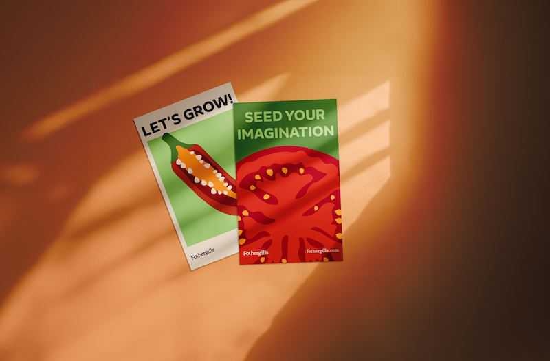
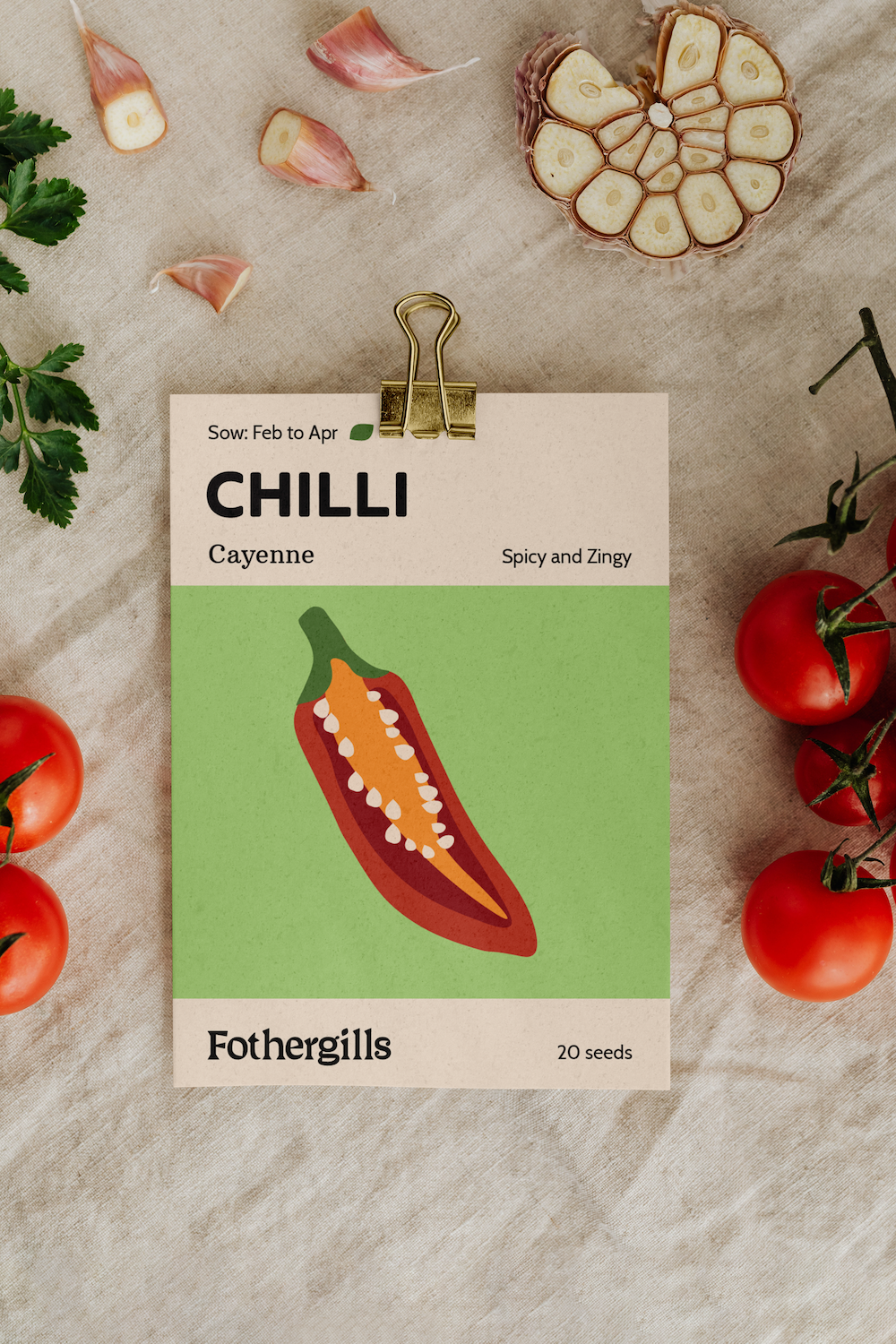
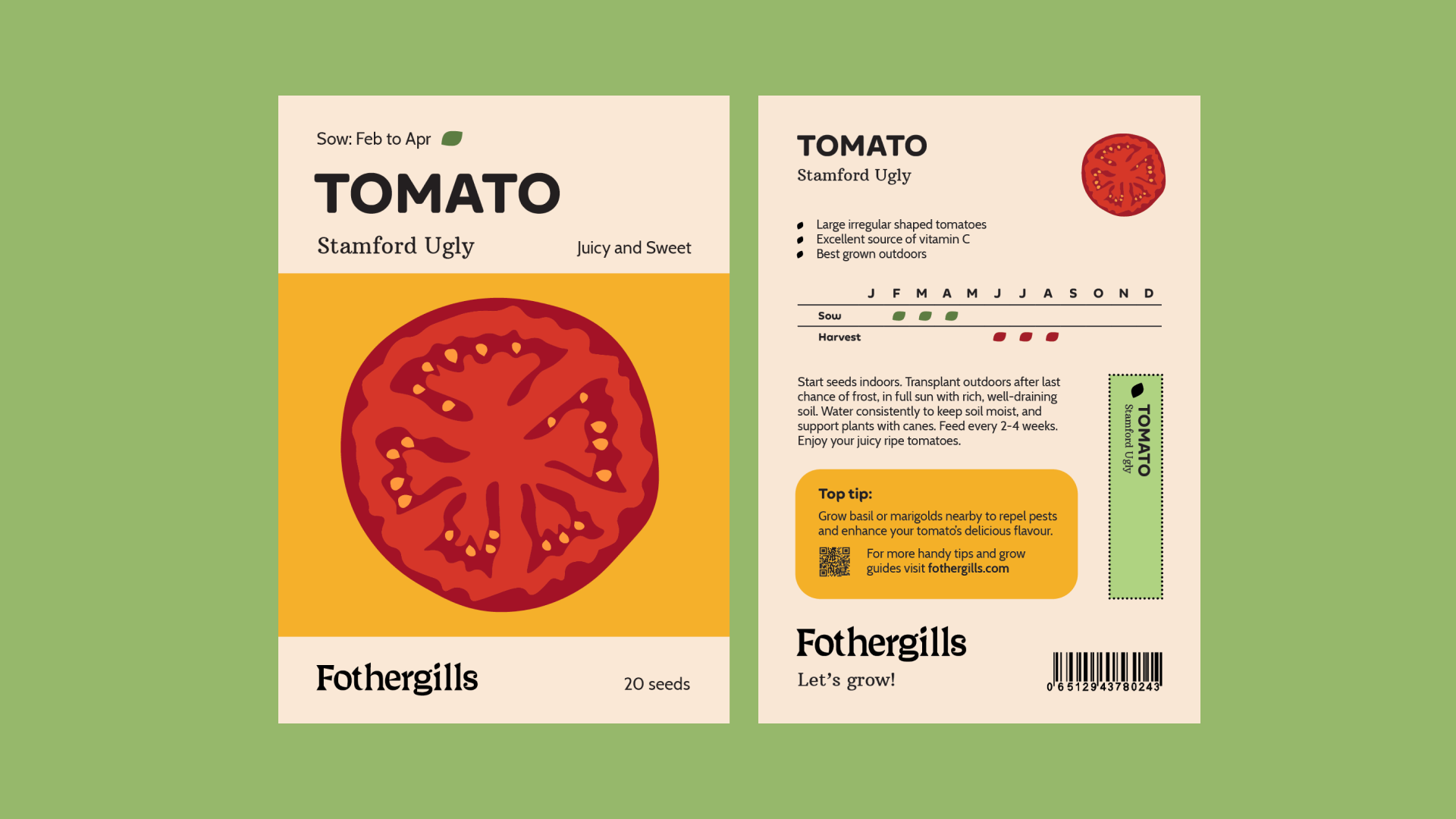
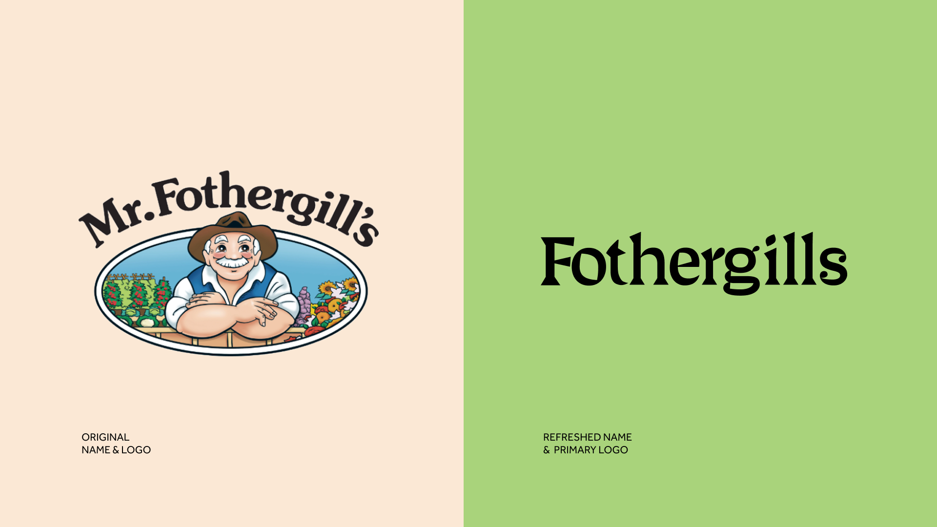
The rebrand concept focuses on refreshing the logo, colour palette, and typography to reflect a more modern, approachable, and environmentally conscious personality. I explored ways to communicate the joy of growing through vibrant visuals, contemporary packaging design, and a friendly, human tone of voice.
The goal was to position Mr Fothergill’s as both a heritage brand and an innovator, bridging traditional gardening values with a fresh, engaging aesthetic that resonates with today’s environmentally aware consumers.
REBRAND | NAMING | CREATIVE DIRECTION | LOGO DESIGN | COPYWRITING | PRINT DESIGN